THE WORLD IN 32 PAGES: PICTURE BOOKS THEN, NOW & ALWAYS

This past weekend I was grateful to be one of the speakers at Wisconsin’s SCBWI conference held in Racine, Wisconsin. As such conferences usually are, it was a time of little sleep and a time of consuming mega-vitamins. Imagine, two days of not having to explain why you want to write for children. Imagine, two days of joyfully talking our particular shop.
In my presentation Friday evening I referred to many books. I promised those in attendance that I would post that bibliography on this blog. And, as time permits, I will try to post bits and pieces from my talk.

Thanks to all in Wisconsin who attended the conference. My plane flight home was a flurry of new book ideas and how to make some old projects better.

Related Bibliography

Ahlberg, Allan. THE ADVENTURES OF BERT. Illus. by Raymond Briggs. Farrar, 2001.

Bader, Barbara. AMERICAN PICTUREBOOKS: FROM NOAH’S ARK TO THE BEAST WITHIN. MacMillan, 1976.

Bright, Robert. GEORGIE. Viking, 1944.

Burton, Virginia Lee. MIKE MULLEGAN AND HIS STEAM SHOVEL. Houghton, 1939

Donaldson, Julie. WHAT THE LADYBUG HEARD. Illus. by Lydia Monks. Holt, 2010.

Goffstein, M.B. GOLDIE THE DOLLMAKER. Farrar, 1969.

Gorbachev, Valeri. WHAT’S THE BIG IDEA, MOLLY? Philomel, 2010.

Hesse, Karen. THE CATS IN KRASINSKI SQUARE. Illus. by Wendy Watson. Scholastic, 2004.

Isol. IT’S USEFUL TO HAVE A DUCK / IT’S USEFUL TO HAVE A BOY. Groundwood, 2007.

Johnson, Crocket. HAROLD AND THE PURPLE CRAYON. Harper, 1955.

Katz, Jill. GALEN’S CAMERA. Illus. by Ji Sun Lee. Picture Window, 2006.

Mack, Jeff. FROG AND FLY: SIX SLURPY STORIES. Philomel, 2012.

Marcus, Leonard, ed.  DEAR GENIUS: THE LETTERS OF URSULA NORDSTROM. HarperCollins, 2000.

Moore, Nancy. THE UNHAPPY HIPPOPOTAMUS. Illus. by Edward Leight. Vanguard, 1957

Muntean, Michaela. DO NOT OPEN THIS BOOK! Illus. by Pascal Lemaitre. Scholastic, 2006.

Rathmann, Peggy. RUBY THE COPYCAT. Scholastic, 1991.

Rosenthal, Amy Krouse and Tom Lichtenheld. DUCK! RABBIT! Chronicle, 2009.

Scarry, Patsy. THE BUNNY BOOK. Illus. by Richard Scarry. Golden Press, 1955.

Scarry, Richard. RABBIT AND HIS FRIENDS. Golden Press, 1953.

Schwartz, Roslyn. THE MOLE SISTERS AND THE RAINY DAY. Annick, 2002.

Shaw, Charles G. IT LOOKED LIKE SPILT MILK. Harper, 1947.

Stein, David Ezra. POUCH! Putnam, 2009.

Thomas, Jan. A BIRTHDAY FOR COW! Harcourt, 2008.

Winter, Jeanette. SEPTEMBER ROSES. Farrar, 2004.

Voice as Character

II of III

For many, one of the challenges of writing is making sure each character has his own unique voice. Who hasn’t received a rejection that referred to our “puppet” or “cardboard” characters? Attending to the body and physicality of our characters can help.

An improv theater exercise has each student walk across the room with a different part of his body leading the way. Try it. Walk across the room with your chin leading the way. Then, with your right shoulder leading the way. By the time the student gets to the other side of the room the way he carries his body has begun to create a particular voice that is not the author’s own.

How does a four-year-old walk across the room? How does an exhausted father walk across the room? Body contributes to voice.

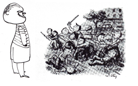
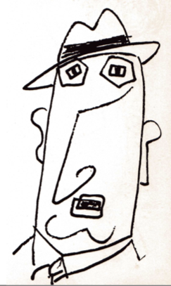
Another way to explore voices is to sink into images (even caricatures) of different people. William Steig’s drawings done long before he thought of SYLVESTER AND THE MAGIC PEBBLE can help our minds play and discover.

Given their body posture and facial expression, how does each of the following characters express their reaction to the scene next to them?

The differences in each character’s response is what makes them unique and interesting.

Bibliography

THE STEIG ALBUM by William Steig. Duel, Sloan and Pearce, 1953.

Voice as Character

I of III

In many ways voice comes down to character whether we are referring to characters in a story or the author/narrator telling the story. Voice is communication and the desire for connection between people. This connection may be face-to-face or leap over years and miles through reading.

A character’s dialogue and action are guided by back-story, but primarily by her immediate wants or needs of the other characters. If a character has no needs or wants why is she in the story? So…what do we, as writers, want or need from our readers? What does our narrator’s voice reveal about us?

As writers and storytellers our primary “want” is capturing and keeping the attention and emotions of our audience. Even if our desire is to do something supposedly more important than keeping their attention such as teaching them something we need answer this reality: How can you teach or inform anyone unless you have their attention? The vital next question is: What are we doing to achieve that “want” of keeping their attention? Volume? Tone? Attitude?

If we encounter resistance to achieving our want in life, we eventually learn that the best tactic is to try another approach. Then another and another. As picture book writers we want the same toolbox of approaches. And, to always being aware of what our storyteller’s voice reveals about us. Warm? Comical? Demanding? Bossy? Scolding? Condescending? Playful? Challenging? Most of all, is it a voice eager to share an experience with an equal?

The Right Word

As writers we know the power of the right word. It is a significant part of writing and revising. Still, many of us feel a resistance toward revising or a sense of failure that must be repaired.

Once again the right word can make all the difference. I was at the Bonn International School in Germany last week to help students with their writing. During a visit to Jen Whitman’s second grade class I learned a new right word. Her students do not revise a manuscript. They revisit a manuscript. What a generous difference and shift in perspective that change of word creates.

When we revisit a place we know what we want to see again, what spots or activities weren’t as engaging as expected, and also what new things we’d like to explore. Perhaps it’s time to stop trying to revise a manuscript, and enjoy revisiting it instead.

Voice

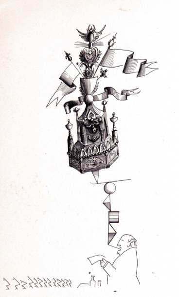
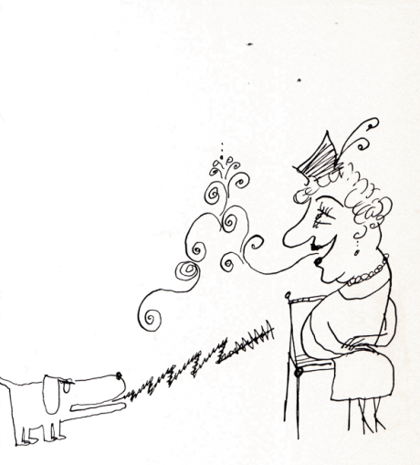
 We’ve all felt the warmth of a kind voice, the burn of a scolding voice, and the confusion of a dithering voice. We also know which of these voices kept our attention. Our readers also experience this interaction thanks to the array of picture books today. Later this month we’ll explore the range of voice on two levels. First, the voice of the narrator toward his audience. Second, the differences between a child’s voice and an adult’s voice in fiction.

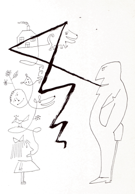
I’ll be away the next three weeks, but wanted to leave you these wonderful visualizations of voice by Saul Steinberg. Do we write to confuse? To overwhelm? Or connect?

THE CATALOGUE by Saul Steinberg. World Publishing, 1962.

We Will Survive!

While sales figures for picture books are down and many pundits have proclaimed the picture book to be a thing of the past, I loudly disagree. If you’re reading this I know you also disagree. We all have a friend in Julie Hedlund. If you don’t already know her blog “Write Up My Life,” you’ll be grateful the day you find it.

Julie honored me with the request of writing a guest post this month as part of her 12 X 12 in 12 year-long adventure. You can find my guest post titled “From Flicker to Final Manuscript” at  <www.writeupmylife.com>.

Thank you, Julie.

Illustrators: Responding to the Text

Kevan Atteberry

#1. What elements of a manuscript first capture your attentions? Plot? Language? Imagery? Tone? Sound? Theme?

Kevan

Obviously, all of those things play a part in choosing to accept a manuscript, with a light edge given to Plot and Tone.  The story has to engage me. It must be fun, hopefully funny, and when you finish it feels complete. (And as a note, if the tone is odd or bordering on irreverent, I jump at the opportunity. But even above the elements you list, I think a strong, likable character is the thing that most often says, “Do this!” Though I love most genres of picture books, the ones that stand out for me, the kind I like to illustrate are character-driven. I want characters that endear themselves to the reader. Characters with strong established personalities in the text alone, but that I get to flesh out visually. Maybe add my own traits or peculiarities to.

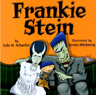
#2. What elements of a manuscript inspire your choice of style, line, and palette? For example, your illustrations in FRANKIE STEIN, LOTS OF LETTERS, and BOOGIE MONSTER are at once related, yet still different from one another.

Kevan

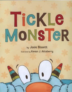
To be honest, when I am offered a book, the art director or editor has chosen me because of a style they have already seen of mine. In discussion with them, they will reference a sample illustration and let me know that that is why they’ve asked me to illustrate the book. I’ve had editors and art directors make suggestions on both line AND palette. In TICKLE MONSTER, we changed the palette a couple of times because the publisher had a particular vision. I did so reluctantly, but in the end I was certain that they had made the right choice. I LOVE the palette in TICKLE MONSTER and BOOGIE MONSTER—as do others—and give all the credit to the publisher for that decision.

#3. Is there a picture book text that you would love to re-illustrate? What about the text excites you?

Kevan

If you are talking about a picture book text by anyone, hmmm…let me think. The first book that comes to mind in Mercer Mayer’s, ONE MONSTER AFTER ANOTHER. A charming story with lovely, fun illustrations and characters. There is no way I could improve on what Mayer did, but I could have the best time creating my own spin on it. GEORGE by Robert Bright would be fun, too. A sweet story with an endearing protagonist. Jose Arugeo’s LOOK WHAT I CAN DO is a wonderful illustration-dependent picture book that would be hilarious to interpret.  The text is nearly non-existent so I don’t know if this is a good example of what about the text excites me. It really is just the inanity of the two characters and their one-upmanship. And then I’d really love to illustrate a collection. Where the illustrations weren’t linear but rather vignettes. Each illustration standing on it’s own, not linked to the previous or the next illustration—like a collection of nursery rhymes, i.e. Mother Goose.

#4. As an illustrator, what is it that you most want writers to understand about your creative process?

Kevan

Probably that ‘I know what I’m doing.’ And to trust me. I will not ruin their story. I will bring it to life and I will treat it with great respect. But the illustration part is mine. It is my half of our collaboration. I am open to any illustration note that is imperative to the story otherwise it is all up to me. And the editor. I don’t want that to sound standoff-ish, I just want to feel comfortable—have them feel comfortable with me—interpreting their story visually.

 THANK YOU, Kevan, for sharing your thoughts. You can find out more about Kevan’s books and illustrations at:  www.oddisgood.com

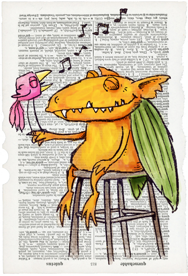
Illus. by Kevan Atteberry

Picture Books Referenced Above

FRANKIE STEIN by Lola M. Schaefer. Illus. by Kevan Atteberry. Marshall Cavendish, 2009.

LOTS OF LETTERS by Tish Rabe. Illus. by Kevan Atteberry. Innovative Kids, 2006.

TICKLE MONSTER by Josie Bissett.  Illus. by Kevan Atteberry. Compendium, 2008.

Groundhog Day

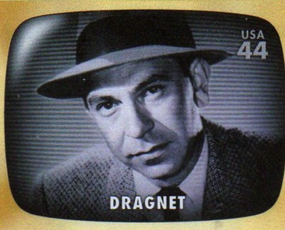
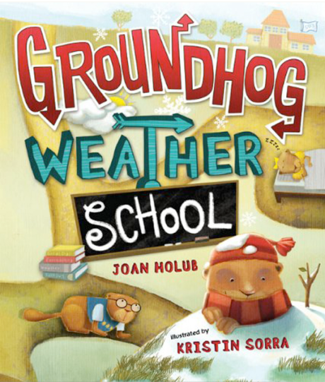
DRAGNET’s detective Jack Webb was famous for supposedly asking for “Just the facts, ma’am.” While that may be advisable for police work, “nothing but the facts” rarely keeps readers engaged. One of the most satisfying developments in recent years has been authors’ ability to blend facts or nonfiction with humor. One of the best is perfect for sharing this time of year–GROUNDHOG WEATHER SCHOOL by Joan Holub. Attempting to impart information about weather, weather forecasting, and groundhogs might have easily induced hibernation amongst readers. But instead, Holub and illustrator Kristin Sorra created a lively, tongue-in-cheek graphic story that’s packed with facts and lots of play.

Find a copy soon. Share it with children, and see what new twists it inspires in your own writing.

GROUNDHOG WEATHER SCHOOL by Joan Holub. Illus. by Kristin Sorra. Putnam, 2009.

Illustrators: Responding to the Text

Craig Orback

 #1. What elements of a manuscript first capture your attention? Plot? Language? Imagery? Tone? Sound? Theme?

Craig

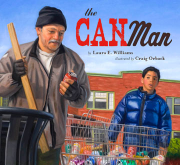
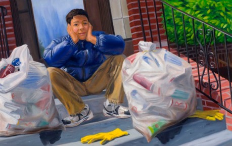
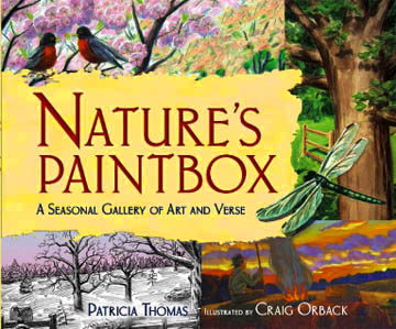
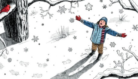
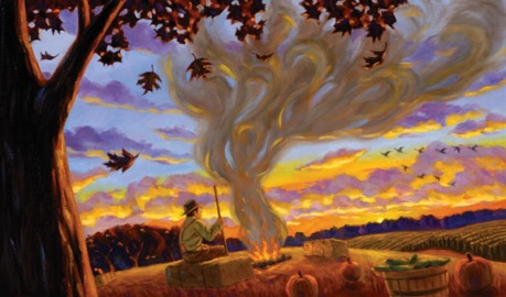
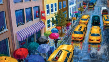
The easy answer would be to say all of the above, which for me is also true. More specifically though I get a lot of enjoyment from the setting, whether it’s historical or not and also the characters. For my picture books THE CAN MAN and NATURE’S PAINTBOX: A SEASONAL GALLERY OF ART AND VERSE both were set in the present which made for a nice change of pace from my typical historical projects. NATURE’S PAINTBOX does not really have a main character; the four seasons were my main characters. Bringing out the fun distinct elements of each season and letting my imagination run wild was really rewarding. It was also my first time illustrating poetry so that brought its own unique challenges. For the book I worked in pen and ink, pastel, watercolor and oil paint to depict each season. Typically an illustrator works in only one consistent medium for each book. For THE CAN MAN it was very character based and deals with serious and topical subject matter like homelessness and wants versus needs as seen through the eyes of a young boy. Tim lives in the city and comes from a family of limited means. He wants a skateboard for his birthday and decides to earn the money himself. I wanted my visuals to be grounded in reality. Living in Seattle at the time I took visual elements from the city but not in any obvious way then put them in the artwork. Traveling around the city with my camera was great fun.

THE CAN MAN

#2. What elements of a manuscript inspire your choice of style, line, and palette?

For example, your illustrations in PAUL BUNYAN, NATURE’S PAINTBOX and THE CAN MAN are at once related, yet still different from one another.

NATURE'S PAINTBOX

NATURE'S PAINTBOX

NATURE'S PAINTBOX

 Craig

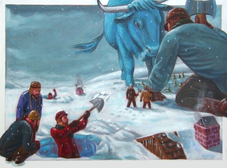
For THE CAN MAN I knew I wanted to work in my usual medium oil to capture the richness and detail of Tim’s life in the city.  Oil painters like Edward Hopper and Wayne Thiebauld among many others were and continue to be an inspiration and I felt that oil paint best captured the urban realism depicted in that story. As I mentioned earlier, in NATURE’S PAINTBOX the poet Patricia Thomas in the text makes comparisons between the seasons and the four different mediums so the decision on what medium to use was made for me. I did however have to practice with pen and ink and pastel, two mediums I hadn’t used much since art school and much earlier. I felt a lot of pressure with that book to make all the different mediums look equal as far as skill level. For PAUL BUNYAN I wanted something flatter and more cartoon like so I worked in acrylic paint and used a lot of line work, which gave me the effect I was looking for. I wanted less realism and a more playful quality.

#3. Is there a picture book text that you would love to re-illustrate? What about the text excites you toward doing this?

Craig

They aren’t really picture books but I love a lot of the classic adventure stories that N.C. Wyeth illustrated a hundred years ago like TREASURE ISLAND, KIDNAPPED, ROBINSON CRUSOE and others. His images are so burned in my brain though it would be pretty hard I think to come up with something new or that wasn’t too influenced by his work. KIDNAPPED is a favorite story I have reread many times. I love the setting of the Scottish Highlands in the 1700’s and the main characters Alan Breck Stewart and David Balfour. The tale is so vivid in every way.

#4. As an illustrator, what is it that you most want writers to understand about your creative process?

Craig

That we take these stories to heart very deeply and try really hard to bring them to life visually. Reading them over and over multiple times, acting out scenes in order to help you sketch the characters better and capture their feelings brings the illustrator into this world the author has created. Along with the satisfaction of completing a project I do feel a little bit of sadness and even a mild depression when it comes time to say goodbye to the world the writer created and I immersed myself in. If you’re lucky though another story awaits just around the corner!

THANK YOU, Craig, for sharing your thoughts and reflections. You can find out more about Craig’s work and books at:  http://www.craigorback.com

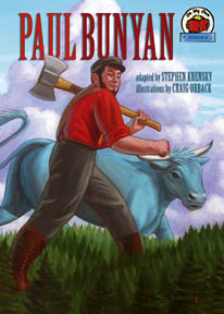
PAUL BUNYAN

 Picture Books Referenced Above

 THE CAN MAN by Laura E. Williams. Lee & Low, 2010.

NATURE’S PAINTBOX: A SEASONAL GALLERY OF ART AND VERSE by Patricia Thomas. Millbrook Press, 2007.

PAUL BUNYAN adapted by Stephen Krensky. Millbrook Press, 2007.

One Picture Book Text: Multiple Interpretations

Charlotte Zolotow

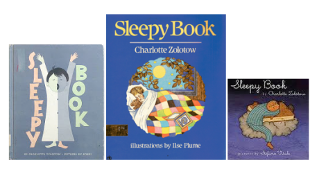
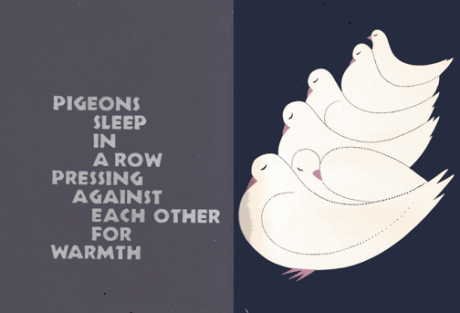
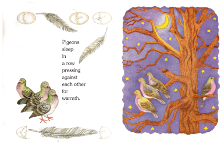
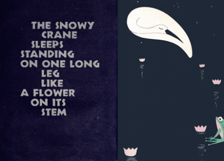
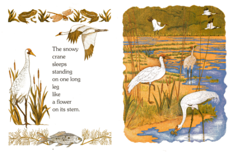
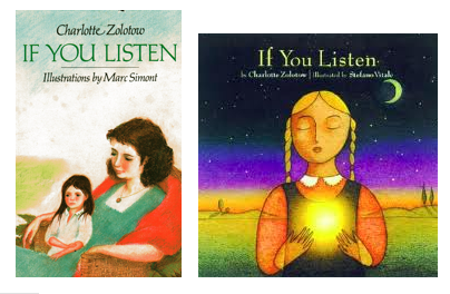
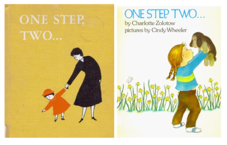
Charlotte Zolotow both edited and wrote many of the outstanding children’s books of the last 60 years. Thanks to the expanse of her writing career, several of her earlier picture books have been re-illustrated in recent years. The differences in styles, trends and printing technology demonstrate once again how many ways there are to interpret a single picture book text.

pigeons illus. by Bobri

pigeons illus. by Plume

cranes illus. by Bobri

cranes illus. by Plume


As picture book writers, we write to communicate with our young readers, but we also write to communicate with our future illustrators.

Picture Books to Explore

IF YOU LISTEN by Charlotte Zolotow. Illus. by Marc Simont. Harper, 1980.

IF YOU LISTEN by Charlotte Zolotow. Illus. by Stefano Vitale. Running Press, 2002.

ONE STEP, TWO by Charlotte Zolotow. Illus. by Cindy Wheeler. Lothrop, Lee & Shepard, 1981.

ONE STEP, TWO by Charlotte Zolotow. Illus. by Roger Duvoisin. Lothrop, Lee & Shepard, 1955.

THE SLEEPY BOOK by Charlotte Zolotow. Illus. by Vladimir Bobri. Lothrop, Lee & Shepard, 1958.

THE SLEEPY BOOK by Charlotte Zolotow. Illus. by Ilse Plume. Harper, 1988.

THE SLEEPY BOOK by Charlotte Zolotow. Illus. by Stefano Vitale. Harper, 2001.